
A guide for entrepreneurs who want to change their brand but don't know if it's the right moment or they're just bored with the colors
When was the last time you realized your brand isn't working anymore?
A few months ago, I received an email from the founder of a cybersecurity company. Subject line: "Help. I think we need to change everything."
Attached: their current logo—a blue shield with Impact font from 2016, a website drowning in Web 2.0 gradients, and a PowerPoint deck where every slide used a different font. "We're pitching to a major bank. When they see this, will they take us seriously?"
I replied briefly: "Depends. Is the problem how you look or what you communicate?" Silence. Then: "...both?"
This is the dilemma I see weekly: entrepreneurs who know something's off with their visual identity but don't know whether it's time to change everything or just fix what's broken. Some rebrand too early. Others too late. And the rest? They do a half-assed refresh on the fly and wake up looking worse than before.
Let's clear this up once and for all: when the hell is the right time for visual rebranding? And more importantly: when isn't it?
The truth nobody tells you: most rebrandings are premature or pointless
The branding industry is full of agencies telling you that you "need a rebrand" for anything. Logo's 3 years old? Rebrand. Competition changed their colors? Rebrand. You're bored with your own brand? Of course, rebrand. Bullshit.
A visual rebrand isn't an aesthetic whim. It's not something you do because you're tired of blue or because you saw a cool gradient at a competitor's. It's a strategic decision, expensive in time and money, that can either relaunch your business or kill it.
Classic example? Tropicana in 2009. They spent millions on a complete packaging rebrand. Result? 20% drop in sales in one month. $30 million lost. They quickly reverted to the old design, tail between their legs.
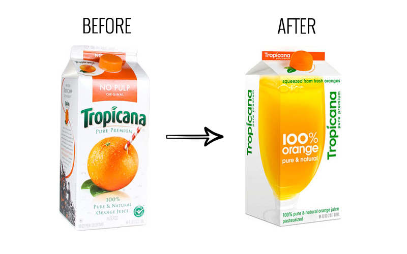
Image taken from the article „What to Learn From Tropicana’s Packaging Redesign Failure?”, published in The Branding Journal. An enjoyable and relevant read about what happens when a well-intentioned rebranding turns into a costly lesson.
Why? Because they changed the visual identity without understanding that people don't buy juice—they buy recognition and trust. When you destroy visual recognition, you destroy the relationship with the customer.
So yes, rebranding can be your brand's salvation or its death. It all depends on whether you make the change for the right reasons, at the right time, in the right way.
So yes, rebranding can be your brand's salvation or its death. It all depends on whether you make the change for the right reasons, at the right time, in the right way.
Clear signs your brand actually needs rebranding (not that you're just bored)
1. Your business has completely transformed, but your brand still looks like day one
You started as a freelancer with a logo made in Canva. Now you have 20 employees and work with corporations. But the visual identity still screams "one-man show working from home in pajamas."
Real example: One of our clients, a software development company, grew from 3 people to 40 in two years. They won major contracts with banks. But their logo was literally the founder's initials drawn in a free font. When they went to presentations, clients asked if they were subcontractors or the main company.
The visual identity wasn't keeping pace with business evolution. And that was costing contracts.
The concrete sign: If your business reality is 3 years ahead of your visual identity, it's time.
2. Clients constantly confuse you with the competition (or don't recognize you at all)
If your brand looks like every other company in your industry—same corporate colors, same tone, same visual clichés—you don't have a brand. You have camouflage.
What I constantly see: IT companies with blue + orange. Marketing agencies with neon pink + black. Consulting with navy + gray. Everyone looks the same. Everyone sounds the same. Nobody stands out.
And when nobody recognizes you, you don't exist in the client's mind.
A simple test: Hide the logo from your website. If you can't tell who you are just from colors, typography, and visual tone—you don't have an identity, you have a template.
3. Your visual identity is organizational chaos
The logo has 3 different versions. Colors vary between site, social media, and presentations. Departments make their own materials however they want. Basically, you have 5 different brands, not one coherent brand.
What's happening here: Every department improvises because there's no clear visual system. Marketing does something in Canva. Sales has a different PPT template. The CEO sends business cards with a different logo.
Result? Zero consistency. Zero trust. Zero brand recognition.
If someone on your team can create "branded" materials without following a visual guide (because one doesn't exist), it's chaos. And chaos is seen by clients as unprofessionalism.
4. Feedback (internal and external) is clear: "You look outdated"
If your employees, partners, and especially potential clients tell you that your visual identity "seems old," don't ignore the signal.
A direct example: An HR tech client lost a major pitch. Feedback from the prospect? "The product seems OK, but everything you showed us—from presentation to site—gave us the impression that you're a company that doesn't invest in itself. How can we invest in you?"
Brutal? Yes. Real? Absolutely.
People make assumptions about your quality based on visual identity. If you look like you're afraid to invest in your own brand, why would they invest in you?
When NOT to rebrand (even though you want to change something)
Let's be clear here too: not every brand problem is solved with rebranding.
Don't rebrand if:
1. You're simply bored with your own brand
Your boredom isn't a market signal. It's personal fatigue. You see the brand daily. Your clients—occasionally. For them, the brand is still fresh.
2. The competition changed their identity and you want to keep up
You're not in an imitation race. If your competitor went minimalist, it doesn't mean you should too. Maybe your current identity is exactly what differentiates you.
3. The problem is strategy, not visual
If your message is confusing, if you don't know who you're addressing or what differentiates you—a new logo won't solve anything. Strategy first, then visuals.
4. You don't have budget and time for complete implementation
A halfway rebrand is worse than none at all. If you don't have resources to consistently implement the new identity across ALL channels—postpone until you're ready.
How to do a visual rebrand that doesn't destroy your business
The process we use at LEZART doesn't start with "let's redesign the logo." It starts with uncomfortable questions:
Stage 1: Ruthless audit (what works, what doesn't, why)
We analyze everything:
We don't assume. We measure.
- Current identity: logo, colors, fonts, visual style, brand manual (if it exists)
- Identity application: site, social media, presentations, print materials
- Consistency: does the brand look the same everywhere?
- Public perception: what clients say, what analytics show, how you compare to competition
We don't assume. We measure.
Stage 2: Strategy before pixels (who you're talking to and what you want to convey)
Here come the essential questions:
Without clear answers to these, any visual identity will just be "something nice," not "something strategic."
- Who are you now vs. who you wanted to be 3 years ago?
- Who is your ideal client and what do they look for in a brand like yours?
- What truly differentiates you from competition? (not "quality and professionalism"—everyone says that)
- What feeling do you want to create when someone sees your brand?
Without clear answers to these, any visual identity will just be "something nice," not "something strategic."
Stage 3: Complete visual system, not just a logo
A good visual rebrand means:
Result? You never improvise. You have a coherent system that works anywhere.
- Logo and variants (full, abbreviated, monochrome, versions for different contexts)
- Color palette (primary, secondary, accents—with clear usage rules)
- Typography (fonts for titles, text, web, print)
- Visual style (iconography, images, visual tone of voice)
- Grid and layout systems (how you arrange elements across various formats)
- Practical applications (business cards, presentations, social media, site)
Result? You never improvise. You have a coherent system that works anywhere.
Stage 4: Brand manual (not optional, necessary)
This guide is your identity Bible. It includes:
Why is it crucial? Because you, your team, future agencies, partners—everyone will use the brand. Without rules, everyone will improvise. And you'll end up back in chaos.
- Logo rules (what's allowed, what's strictly forbidden)
- Exact palettes (HEX, RGB, CMYK, Pantone)
- Examples of good and bad practices
- Templates for frequent materials
Why is it crucial? Because you, your team, future agencies, partners—everyone will use the brand. Without rules, everyone will improvise. And you'll end up back in chaos.
Stage 5: Controlled transition, not overnight revolution
We don't launch the rebrand like a coup d'état.
If the public reacts negatively to something—we adjust. We don't insist out of stubbornness.
- Test variants (A/B on landing pages, focus groups for reactions)
- Communicate the change (why we're doing this, what's changing, what stays)
- Implement gradually (site, social media, print materials, email signature)
- Monitor reactions (engagement, direct feedback, sales impact)
If the public reacts negatively to something—we adjust. We don't insist out of stubbornness.
How long it takes and what a visual rebrand costs (honest answers)
Real timeline:
Small companies/startups: 2–4 months
(audit, strategy, design, testing, implementation)
Medium companies/corporate: 4–8 months
(more stakeholders, more touchpoints, complex approval process)
Large corporations: 6–12+ months
(multiple departments, derivative brands, global implementation)
(audit, strategy, design, testing, implementation)
Medium companies/corporate: 4–8 months
(more stakeholders, more touchpoints, complex approval process)
Large corporations: 6–12+ months
(multiple departments, derivative brands, global implementation)
Costs (approximately):
I won't give you exact figures because it depends on complexity. But let's be clear:
If you're thinking "it's expensive"—compare it with the cost of losing contracts because you look amateur. Usually, a single lost contract costs more than the entire rebrand.
- Cheap rebrand (under €5,000) = Logo + a few colors. No strategy, no manual, no system.
- Mid-range rebrand (€10,000–30,000) = Strategy + visual system + manual + partial implementation.
- Premium rebrand (€50,000+) = Complete process, dedicated team, extensive testing, global implementation.
If you're thinking "it's expensive"—compare it with the cost of losing contracts because you look amateur. Usually, a single lost contract costs more than the entire rebrand.
Questions everyone asks (and answers without bullshit)
"Can we keep the logo and just change the rest?"
Depends. If the logo is solid and recognized, yes—you can do a refresh around it. If the logo is the main problem, no. You don't build a new brand on a cracked foundation.
"Do we need to publicly announce we're rebranding?"
Yes. Transparency builds trust. Tell people WHY you're doing it. Otherwise, you seem like a different company and generate confusion.
"How do we measure if the rebrand worked?"
Look at:
If after 6 months you don't see measurable improvements—something didn't go well.
"Why not do it internally with our designer?"
You can. If your designer knows brand strategy, visual audit, system design, coordinated implementation, and project management. If they only know Illustrator—no.
Depends. If the logo is solid and recognized, yes—you can do a refresh around it. If the logo is the main problem, no. You don't build a new brand on a cracked foundation.
"Do we need to publicly announce we're rebranding?"
Yes. Transparency builds trust. Tell people WHY you're doing it. Otherwise, you seem like a different company and generate confusion.
"How do we measure if the rebrand worked?"
Look at:
- Visual recognition (do people identify you more easily?)
- Engagement (do they react more to your content?)
- Lead quality (does it attract the right clients?)
- Direct feedback (what are people saying?)
- Sales (increasing, decreasing, stagnating?)
If after 6 months you don't see measurable improvements—something didn't go well.
"Why not do it internally with our designer?"
You can. If your designer knows brand strategy, visual audit, system design, coordinated implementation, and project management. If they only know Illustrator—no.
The short story: rebranding isn't about you
Two years ago, a client told me: "I want a minimalist logo, modern gradient, that font I see everywhere."
I asked: "Why?"
"Because that's the trend now."
"And what does that solve?"
Long silence. Then: "...I look modern?"
No.
You look like everyone else following the same trend. Rebranding isn't about what you like. It's about what your brand communicates to those who matter—the clients.
If you rebrand out of boredom, imitation, or insecurity—you risk losing the identity that got you here. If you do it strategically, at the right time, based on real data and feedback—you can transform your brand into an unbeatable competitive advantage.
Simple: do it when needed, not when you feel like it.
Want to know if it's time for a rebrand or not?
Send us your current visual identity for audit at audit@lezart.org
We'll respond honestly within 24h if you need:
Include in the email:
No abstract 40-page consultation.
No pitch disguised as "free audit."
Just a direct, brutally honest answer from people who do this daily
.
📧 audit@lezart.org — wait for our reply.
We'll respond honestly within 24h if you need:
- Complete rebrand—current identity is costing you money
- Visual refresh—it's solid, but needs adjusting
- Nothing—brand is OK, focus on something else
Include in the email:
- Current logo (if you have one)
- Link to site/social media
- 2-3 sentences about what your company does
No abstract 40-page consultation.
No pitch disguised as "free audit."
Just a direct, brutally honest answer from people who do this daily
.
📧 audit@lezart.org — wait for our reply.
Lorenzo, Creative Director @ LEZART STUDIO
(Written by me, Friday night, with a cold espresso and frustration when I see bad rebrands)
(Written by me, Friday night, with a cold espresso and frustration when I see bad rebrands)